Design | Print
Connecting through science
|
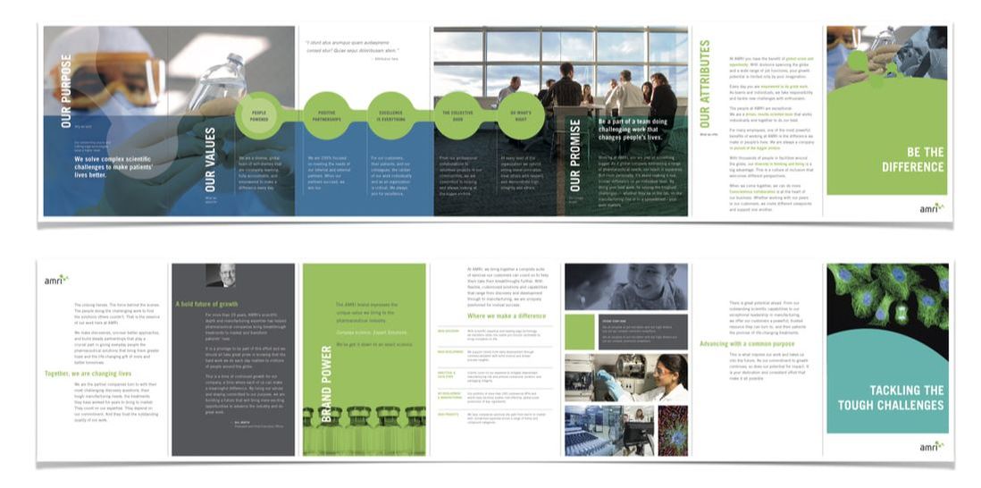
AMRI is an "end-to-end CDMO built to help pharmaceutical and biotech companies improve patients’ lives."
|
Problem:
Create a visual expression that builds on the brand's purpose, values and purpose. Articulate their mission to improve the lives of patients. |
Solution:
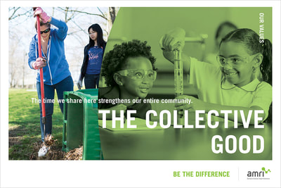
Leverage the shapes found in the company's atom-inspired logo to create visual linkages between their values, their science, and those who benefit. |
Below: Spirit book (accordion fold)
Below: Wall posters — series of five, one per featured value (click to see larger)
Think strategically
|
American Funds (AF) Retirement Planning Training Camp materials were developed for a key partner in the sales and evangelizing of American Funds — the financial advisor. This is an audience with limited time and attention and who are continually bombarded by business graphics created by business people for other business people. Our goal was to differentiate our product and to create a compelling theme around which AF sales folks could interact with advisors during country-wide, invitation-only training events. T-shirts and other themed tie-ins were developed in addition to the play book.
|
Collaborated with senior writer to develop training camp metaphor using football theme to build rapport among an audience conditioned to using sports talk as convenient ice-breakers and as engaging business metaphors. Classic plays such as the “single-wing” were used to illuminate effective strategies and key concepts in the training.
|
Expectations exceeded:
|
Plan big for small business
|
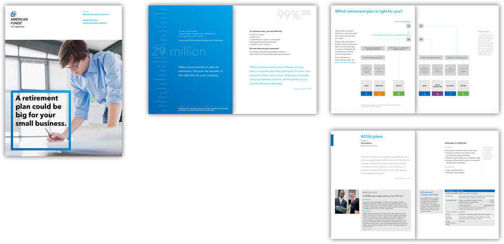
American Funds, small business brochure was created to present a consolidated view of our retirement plan offerings in the small business space, address common misconceptions about retirement plans for same, and provide the sales team a reason to contact their prospects and to quickly determine their needs and how to solve for them.
|
A simple decision tree doubles as a table of contents to anchor the brochure and serves as a directory of American Funds retirement solutions. Each solution is accompanied by a hypothetical scenario and pricing table with language and graphics kept to a minimum.
|
The brochure was well received, requiring multiple reprints to keep up with unprecedented demand.
|
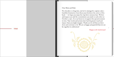
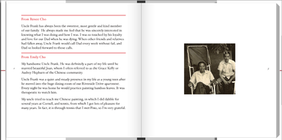
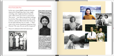
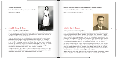
Celebrate 50 years between the covers
|
Click on thumbnails above for larger views. To see all pages in the book on the Blurb website, click here.
|
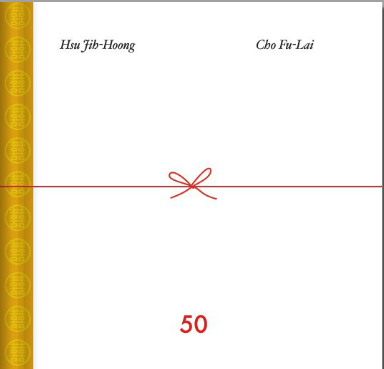
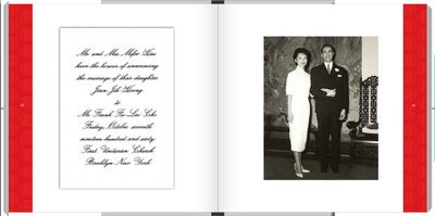
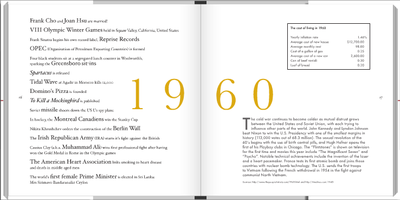
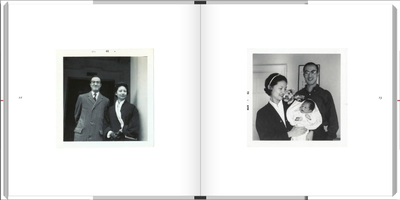
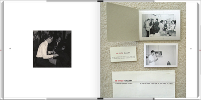
Frank and Joan Cho were planning to celebrate their 50th wedding anniversary, and while some folks would be able to visit in person, many would simply be unable to attend. The intention was to create a keepsake for the Chos and to thank those who participated and/or contributed by providing them each with their own copy of the book.
Stories and photos were collected in advance from friends and family and woven together with a variety of ephemera, all presented in a hard-cover book with a glossy jacket that was produced in an edition of 10, online at Blurb.com. The look of the book was driven by its content: The covers used the red string and knot metaphors to effectively bookend the content; stories were featured and attributed to their respective contributors; and thematic cut paper art, Chinese symbols and the celebratory and royal colors of red and saffron were used throughout. |
Begin the healing
|
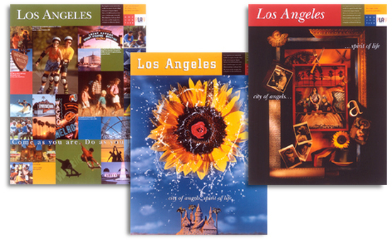
The Los Angeles Convention and Visitor’s Bureau (LACVB) was tasked with promoting Los Angeles as a travel destination for tourists in the wake of the riots that followed the Rodney King beating. Research showed that potential visitors could be classified into three general categories: The family vacationer, the sun seeker or outdoor enthusiast, and the culture vulture. Initial attempts to capture the spirit of Los Angeles in one poster proved too ambitious, hence the proposed triptych as shown. Custom photographs by Scott Morgan (sunflower) and Stuart Watson (frame assemblage) were commissioned to complement the more conservative grid of typical tourist images. The Bureau ultimately decided to pursue other options and these posters were never produced.
|
Perform for the arts
|
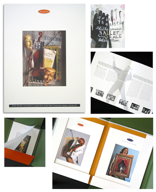
The Music Center of Los Angeles is home to the prestigious Dorothy Chandler Pavilion, the Ahmanson Theatre, the Mark Taper Forum and the Walt Disney Concert Hall. The capital development campaign was targeted to a fairly conservative audience of organizations and upper income individuals who are well educated and in many cases already patrons of the arts. The materials had to capture the essence of the performing arts and satisfy the departments of dance, opera and theatre without alienating potential donors. Evocative photo illustrations by Geof Kern were commissioned to showcase icons that represented each of the performing arts. Combined with existing images, a simple grid and a palette of rich colors, the result spotlighted the arts while adopting an appropriate level of restraint in its presentation.
|
Craft an image
|
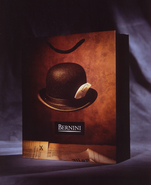
Bernini is a high end menswear retailer in Los Angeles who was looking to build marketshare in a crowded marketplace. An identity was created that used classic fonts and rich color palettes inspired by the fashions they carried. The goal was to craft an image of sophistication and to position Bernini in the same class as the brands they sold — brands like Armani and Boss. Logotype, packaging, stationery and special announcements were coordinated to present a unified vision to both industry insiders and buying public alike.
|
Grow your business
|
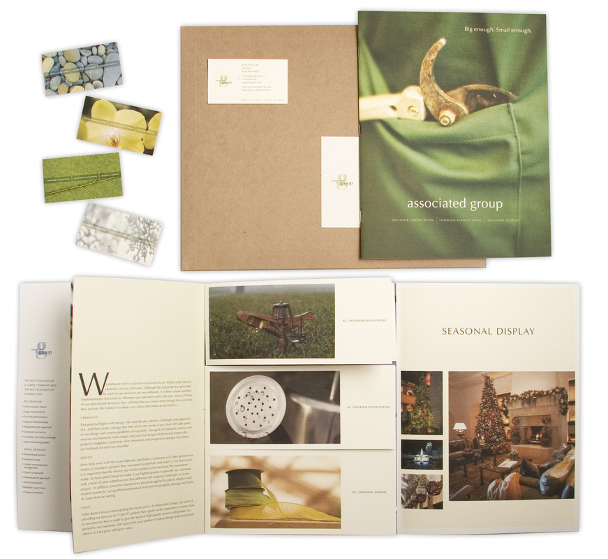
Associated Group (AG) is based in Santa Ana, California, and is comprised of three divisions — Exterior Landscaping, Interior Plantscaping and Seasonal Display. Depending on the size and needs of their client, Associated Group may sell the services of the group at large or any one of the three divisions individually, hence the concept of “Big enough. Small enough.”
Uncoated paper was chosen for its tactile appeal; interesting page sizes and friendly, hands-on photography were used to underscore the company’s commitment to creativity and service, two of their key differentiators. Additional quantities of the middle form were printed and distributed to each of the three respective divisions for use when they wanted to market themselves individually. |
Think big in small places
|
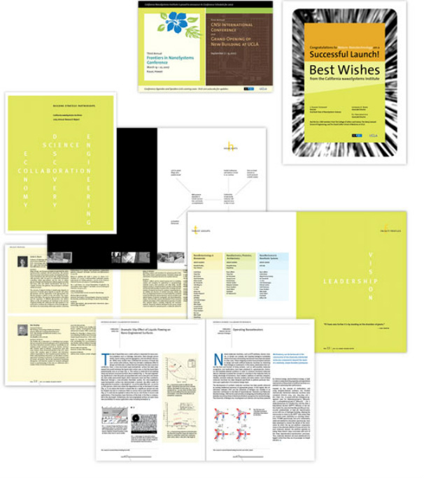
CnSI annual reports and special announcements were created to showcase the discoveries and academic rigor of the California NanoSystems Institute at UCLA. Our goal was to bring a level of sophistication and respect to the printed materials coming from the institute.
A modular grid was designed to accommodate a variety of content in a thoughtful and controlled presentation. The use of a bright citroen color set the materials apart visually from the sea of blue and gold official colors associated with many pieces produced by UCLA. |
Lead by example
|
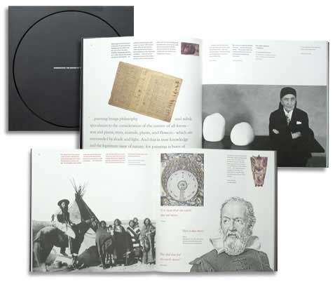
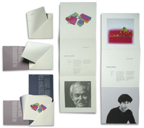
Simpson Paper was the premier manufacturer of text and cover papers in the United States. They were one of the first mills to produce themed books that showcased their product and also one of the first to marry print demonstrations with blank samples in their swatchbooks. Simpson understood that their marketing efforts bore more fruit when directed to the specifying audience of designers rather than their traditional target audience of printers.
Early promotions would use the full offering of colors available in one selected line of Simpson papers. This proved to be costly, however, and it soon became more common to use a variety of their papers in each promotion: By combining selected papers from various lines, Simpson was able to cross promote their product and maximize their exposure for the dollar. |
|
TOP
Dimensions: The Design of the Earth was commissioned to celebrate Simpson's first centennial which coincided with earth's 45 millionth. Dimensions combined multiple lines of paper and was divided into three sections that showed Earth as seen in the arts and humanities; in empire and expansion; and in science and technology. Featured in a pocket on the inside back cover was a large poster that graphically illustrated various facts about earth and its relation to the universe. This project was the brainchild of James Cross and Maxwell Arnold, the writer. It represents an ideal balance of form and content. Design: James Cross, Yee-Ping Cho. BOTTOM Japan: The new tradition featured prominent members of the Japanese design community and their work. It is a good example of a promotion that showcased one line of paper, in this case, Teton. Various printing and specialty techniques were used including die cutting, foil stamping, metallic inks, thermography, touch plates and embossing. The container took its cue from the subject matter and was engineered to accomodate all twelve color inserts without the need for a mechanical fastener. |
Build your case
|
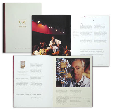
The University of Southern California has long been one of Southern California's most prestigious universities. The Building on Excellence campaign was launched with a goal of raising $1 billion dollars for education and infrastructure development. There were several printed components in the campaign that included invitations, folders, announcements and the Case Book shown adjacent. The USC colors of cardinal and gold were married with a simple yet flexible grid and large type for legibility.
|
The use of case studies, intimate portraits by photographer John Livzey and pull quotes from alumni, faculty and students helped to forge an emotional connection with the reader. Production value was high and small details like embossing and the addition of bookbinder's cloth along the spine helped to impart a sense of quality to the finished piece.
|
Educate young minds
|
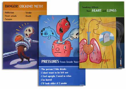
The Best Foundation launched an educational program designed to inform children about the dangers of substance abuse. Co-developed with the Rand Corporation, these posters were the visual component that accompanied a prepared script to be presented by teachers to their students.
|
There were twelve posters in all and each poster was designed for ease of legibility with the goals of sparking interest in the subject and leaving a memorable impression of the lesson plan. A rich color palette, legible type and a simple format ensured consistency from poster to poster. Six artists were chosen to communicate concepts in a variety of styles.
|
Manage the bottom line
|
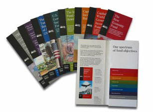
Capital Group is one of the leading asset managers in the world. The Fund Fact brochure system was developed to introduce financial advisors to the suite of American Funds as they related to a color coded thermometer of volatility.
|
The brochures also doubled conveniently as a sales tool. The assignment required the art direction of multiple illustrators and resulted in a template system complete with font, grid, color and style instructions delivered on a cd to the client.
|
Change your exposure
|
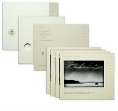
Jeff Zaruba is a much sought after professional photographer who is based in the Northern California area. After many years of shooting successfully in the corporate arena, Jeff began a concerted effort to move his business and work in a new, more personal direction — the resulting images are sensual, dreamy and romantic. The notions of simplicity and contemplation colored our explorations and resulted in the use of subtle colors, clean typography and calculated amounts of white space.
We collaborated on the repositioning of his company, designing everything from a new logotype and stationery to a series of postcards, trade ads and a specialty promotion, shown adjacent. The promotion consisted of four sets with each set featuring a slip case and cards with different, hand tipped images. Each card was letterpressed with the new logotype and a small quote from Jeff that gave some insight into the accompanying photograph. |
Redefine a voice
|
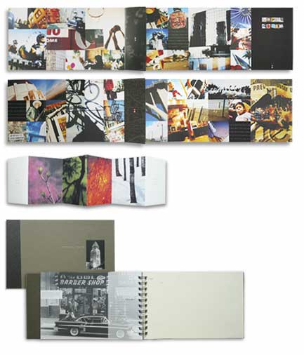
Costello Brothers Lithographers was a small offset litho company located in Alhambra, California. As part of an ambitious repositioning campaign designed to increase sales from high end, design driven studios, they commissioned an overhaul of their identity and related marketing materials.
The concept was to keep all of the design simple and to let the printing and production value sell itself. This approach provided a noticeable contrast to most of the text heavy materials coming from their competition. Shown top to bottom are a capabilities brochure titled Local Color, a holiday card that celebrated the seasons and a date book that commemorated Costello's anniversary with historic photos from the year they started the business. |
